

Typography Exemplar Lesson

I have been working on creating some examples for various typography techniques for the students in my GRA-340 Typography course at SNHU.
This example was designed to show display and body typefaces, contrast, creating and using a diagonal grid, drop caps, and tracking/kerning with justified text when you don't want to hyphenate words at the ends of lines. The above image is the first draft. I will discuss the image and make some changes below.
Designing at 45° Angles from the Document and Baseline Grids
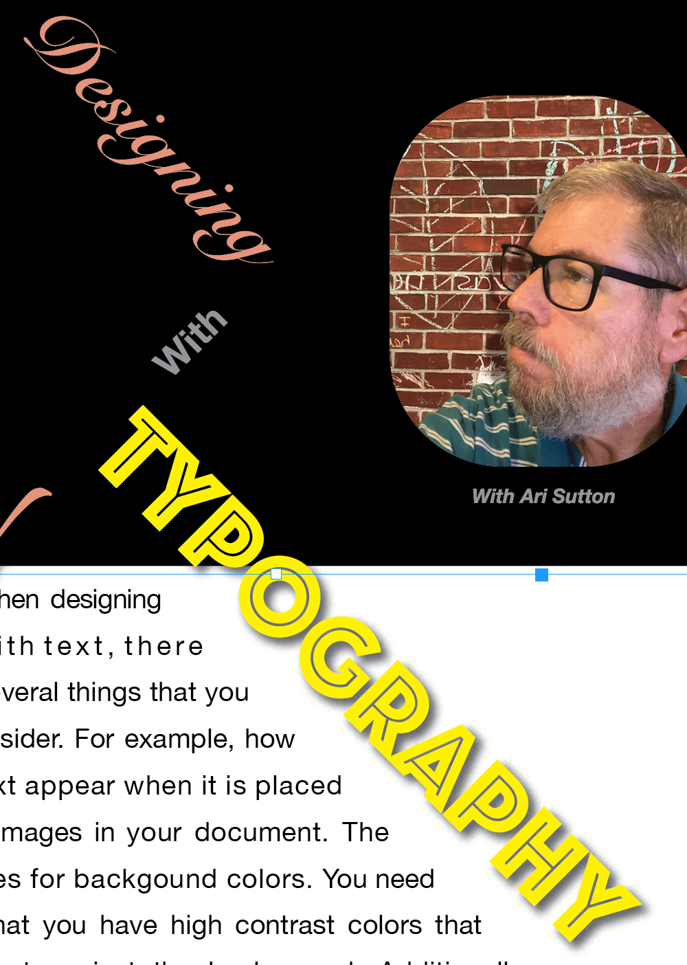
I wanted to do something drastic with the title, so I decided to create text that was at 45° angles from the document and baseline grids. Essentially, the baseline and document grids exist to help you align things on your pages. Designers can set the type and other objects to snap to the grids so that things align perfectly in InDesign. However, while these grids are adjustable, you cannot change their angle.
To compensate, I created two text boxes and applied custom grids to both. One of the text boxes I rotated 45° clockwise, and the other -45°, which is 45° counterclockwise. I locked both text boxes with the grids visible, which gave me a diagonal 45° angle grid of 20 pts to work from. That made aligning the text simple because I used font sizes that are multiples of 20 pts.
While this technique is more useful for designing things like movie posters, it can also make for an eye capturing title for a magazine page or something that needs to command attention.
CONTRAST

Initially, I wanted to use red here and for the drop cap, which worked out okay for the digital version, but when I test printed it, the contrast was too low. This was a problem that I needed to address. Essentially, the red is too dark; therefore, it gets lost in the black background.

By changing the tint on the red to 50%, the color became more pink. It now jumps out against the black background. Remember, contrast is caused by a difference in value and hue. In this case, the red was too dark to show up well. I could have also decided to change the background color, but I decided to stick with the black. It may not have been my first choice for the color, but for the purpose of this demonstration, it works.

Notice that the yellow — which is a much lighter value than the red or the pink — jumps out against the black. The white body text is also providing good contrast here.
Drop Caps

Drop caps are a nice design element that are relatively easy to add to make your typography more elegant and attractive. In InDesign, it is easy to add drop caps by using the drop caps settings in the paragraph selection area of the properties panel. See below.

Notice inside the red box. This is where you set your drop caps. The left side is for deciding how many lines of text you want to enlarge your drop cap letter(s) to for the paragraph(s) within the text box. On the right, you can set the number add additional characters from the beginning of your first word to the drop cap. For this project, I chose a drop cap of five lines and one character. Next, I changed the typeface from Helvetica Neue to Zapfino, and matched the color from the Design word, which is red at 50% tint.
In Gestalt theory, similarities (like color) can help the reader/viewer make connections between parts of a design. Therefore, I am connecting the drop cap as a design element of the page by choosing the same color for both.
Making Adjustments
I didn't love the way that looked as a plain drop cap with a square box around it. With the chosen font, it overlapped some of the text in the first words on each line and interfered with the readability. It also didn't stand out enough from the text. Therefore, I decided to cut the drop cap from the paragraph, and pasted it into a new text box.
I changed the text to an object by opening the type, dropdown menu, and selecting "create outlines." Then, I added a text wrap around the image of the letter, not the bounding box. That allowed me to create the angle that I was looking for.
After that, I dragged the drop cap over the text box aligning it with the bottom of line three and extending the top and left of the letter outside the text box to make it stand out apart from the text while still being the first letter of the paragraph. (see below)

Display vs Body Type


Display Typefaces
The Designing, W, and Typography texts above all make use of a category of typefaces that we call display type. As the name implies, display type is used when you want text to stand out and catch the reader's eye. Desiging is written in Snell Roundhand. W — as mentioned above —is Zapfino, and Typography make use of a typeface called Phosphate. While these are all very different looking letters, they share one thing in common: they can attract a reader's eye. Use them for headings, logo designs, or any text that is only a couple of words long that you want to jump off the page.

Body typefaces
Conversely, body paragraphs require the maximum readability. Therefore, it is best to use plain typefaces that are clean and easily read by the target audience. In general, choose a serif font for printed design and a sans serif font for digital publications. In this case, the body paragraph as well as the word "With" in Designing With Typography use Helvetica Neue, which is a modern, sans serif font.
Reading White Text on a Black Background

While there is good contrast between the white text and the black background — which makes the text readable — for longer texts, it my be more challenging for the reader than reading black text on white. Therefore one should consider the length of the text as a factor about whether this kind of design is a good choice for your project. Let's see how it looks when I drop in a white background and turn the text to black below.

To make this change, I made a white rectangle over the body paragraph area. Then, I used the arrange tool to move it behind the text. Afterward, I selected the text and changed the color to black using the same font settings. As you can see, it is a different experience for the reader that may be easier on the eye than using a lot of white text on black.
A note about the drop cap and title
While this adjustment helped the readability for longer texts, it caused some contrast issues with the drop cap, and part of the Typography word. Neither color stood out against the white background well. I resolved both by adding a drop shadow effect to each box. Using drop shadows can help increase readability at times, but keep that for display texts only. Using drop shadows on long body texts to create contrast still reduces the readability for your audience.

It also would have worked, in this case, to go with the red color that I originally wanted because there is better contrast with the red against the white. However, since I wanted to tie the drop cap to the Design word in my title — which is still pink on black — I decided not to go back to the red drop cap.
Tracking, Kerning, and Justified Text

Justified text is when we are aligning both the left and right sides of the paragraphs to make text that begins and ends at the same points on each line. This makes your text look neat and organized. However, it also creates either many hyphens to break words over lines for easiest alignment, or it makes the spaces between words uneven, and sometimes quite large. In the image above, there were huge spaces between the words "with text, there" on the second line of the paragraph. To fix that, I went to the paragraph tools on the properties panel, and adjusted the tracking, which is the spacing between the letters. Notice how the word "when" is spread out wider than the word "several" right below it. This reduced the amount of space needed between the words, and made the overall design look cleaner and neater.
For the purpose of definition, tracking is the spacing across entire words. A designer can also adjust the space between two letters of text. That is called kerning, and it is also done on the properties panel in InDesign.
Example


Take a look at the two boxes above from our body paragraph. While the top lines aren't too difficult to read, I noticed that the spacing between words in line two is somewhat bigger than the spaces in lines above and below it. To correct that, I selected the entire second line and applied a tracking of 30 to it, which increased the spacing between the letters slightly while decreasing the spacing between the words so that it looks more similar to the lines around it as you can see in the bottom example.
Final Image With a Note About the Image
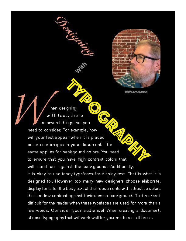
Ultimately, I decided that since there is only one paragraph of reading, that I would go with this design for my example. One of the changes that I made that wasn't discussed above has nothing to do with typography. I changed the image.
In the original image, I was facing away from the text, which wasn't working for me. It was also too large and distracting, and it didn't serve much of a purpose. Therefore, I decided to select the image, and used the transform>flip horizontal tool. That reversed the way I was facing. Additionally, I cropped the image inside the box, reduced the overall size of the image and the caption, and moved it a little lower on the page to have a couple of effects on the overall design of the page.
The first effect I learned from comic book design. It is important to lead the reader's eye through the page. By making the image smaller, it makes it less likely that it is the focal point of the page. However, if it is the first thing the reader notices, then flipping, cropping, and lowering the image on the page makes it appear as though my eyes are focused on the "Designing" word. Comic book artists use this technique frequently when they want to lead the viewer through the page in the correct direction. This is especially important when the panels on the page don't follow the traditional "Z" patten of left-to-right and top-to-bottom. By having a focal point on the right side of the page that is slightly lower than the title, I decided that it would be beneficial to employ this techniques to lead the focus of the reader back to the purpose of the page, which is
"Designing With Typography."
"Designing With Typography."


